Logo system
Primary, secondary, responsive, and supporting marks designed for real-world scale and application.
 Lion + Lamb CreativePay an invoice
Service 02 · Visual identity
A logo is only one moment in a brand. We create a connected visual language that stays recognizable across packaging, print, social, environments, and screens.
Start a conversation ↗Why it matters
The goal is not decoration. It is recognition: a visual system with enough character to be remembered and enough discipline to keep working as the business grows.
What we build
Every engagement is shaped around the business, but the essentials stay focused: clarity, distinction, and practical tools your team can use.
Primary, secondary, responsive, and supporting marks designed for real-world scale and application.
A distinctive palette and type system chosen for expression, clarity, accessibility, and practical use.
Supporting shapes, patterns, illustration direction, image treatment, and composition principles that build recognition.
A straightforward reference for using the system well, plus organized files ready for print and digital teams.
How we get there
Strategy becomes a visual brief with clear principles, references, and measures of success.
We develop distinct creative territories and pressure-test the strongest direction across applications.
The chosen idea expands into marks, type, color, supporting elements, and repeatable layouts.
We refine every file, document the system, and make launch feel clear instead of fragile.
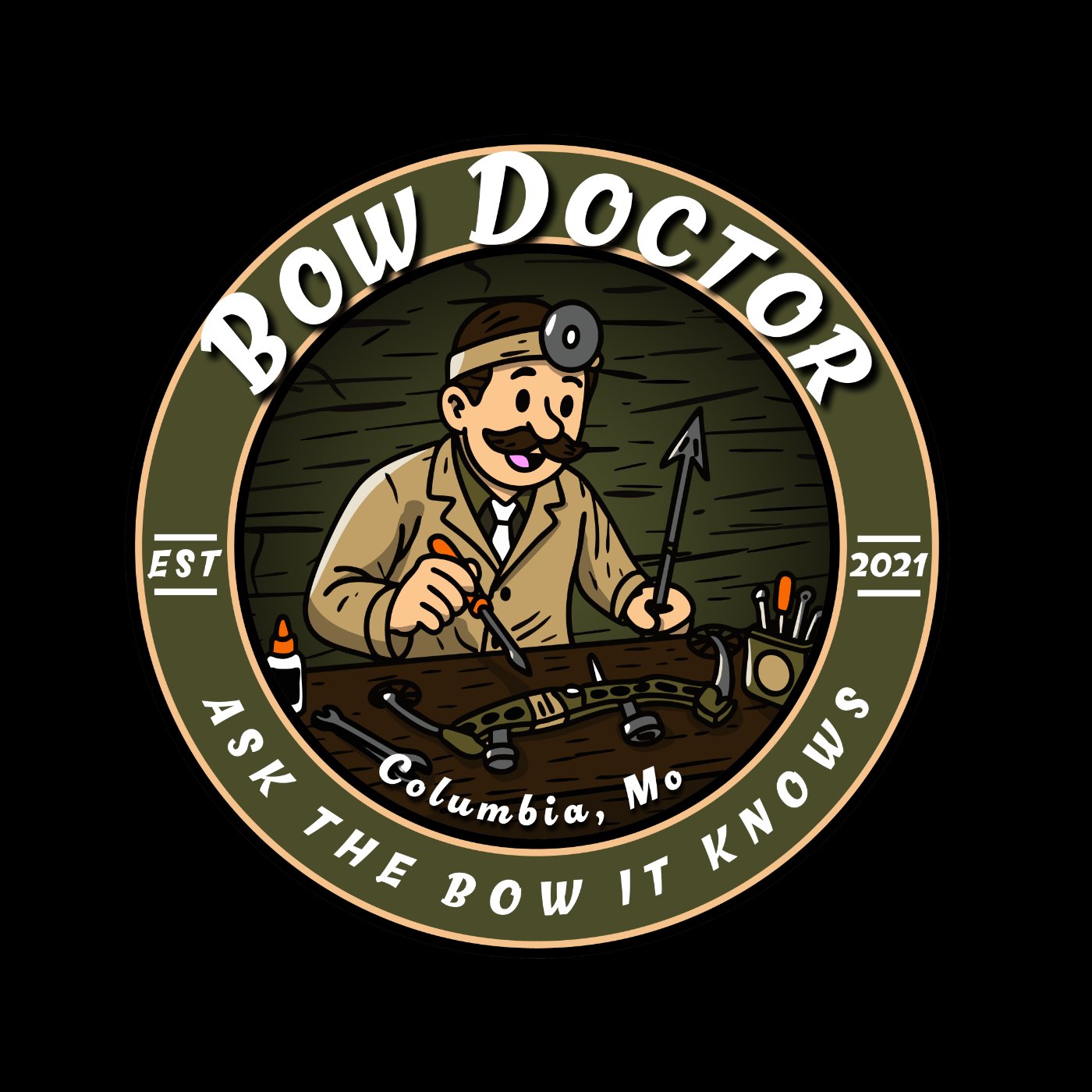
Identity in practice
The Bow Doctor identity moved beyond a generic category cue and into a character-rich system that feels local, credible, and unmistakably theirs.
A good fit when
Start a project
Tell us what you are building, where the work feels stuck, and what a strong outcome would change for the business.
Start a conversation ↗